MiroMedic focuses on clarity, structure, and real operational needs, helping healthcare professionals stay organized and in control throughout the day.
My role:
Product Designer (UX/UI)
Logo Concept & Meaning
The name MiroMedic is derived from the Macedonian word “Mir”, meaning peace.
In healthcare, peace represents more than a calm state — it reflects clarity, trust, and balance. Independent clinics often work under constant pressure, switching between patients, schedules, and administrative tasks. The idea behind MiroMedic was to create a system that brings a sense of calm and control into these daily workflows.
Birds as a Symbol of Peace & Flow
The logo is built around the concept of two birds, a universal symbol of peace, harmony, and freedom. In this context, the birds represent:
- Balance between patients and practitioners
- Smooth flow between tasks, appointments, and communication
- A lightweight system that supports work without restricting it
Rather than depicting a single bird, the use of two connected birds symbolizes connection and cooperation — between healthcare professionals, patients, and the system that supports them.
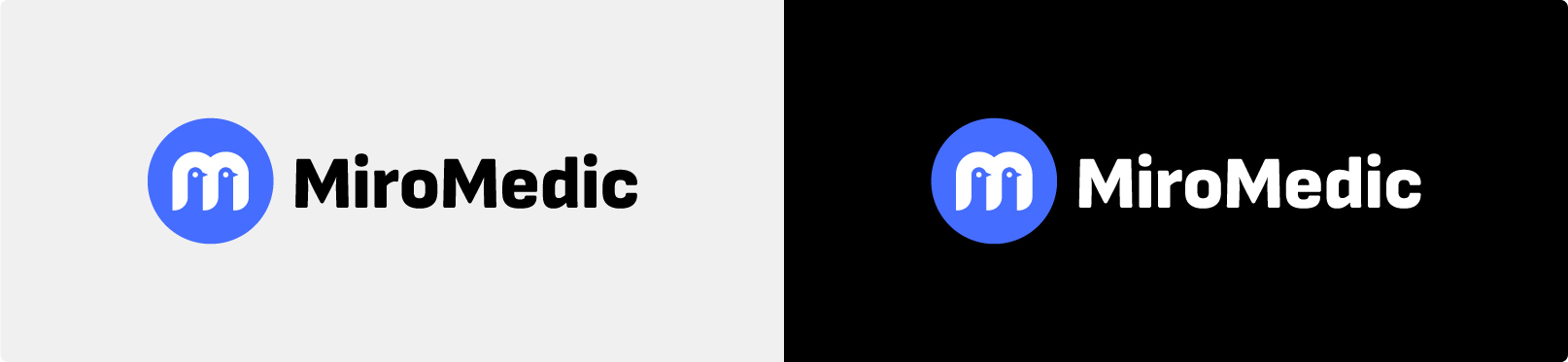
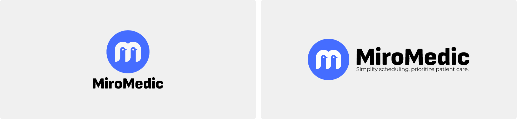
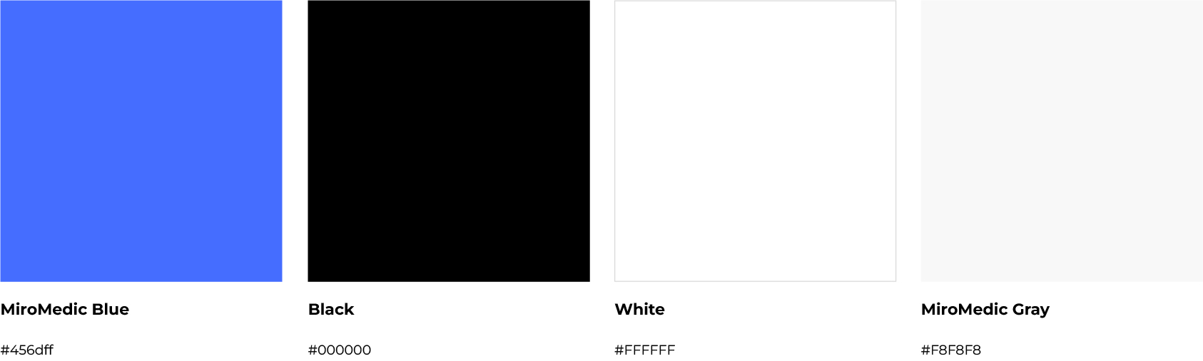
Blue & White Color Meaning
The blue and white color combination reinforces the logo’s message:
- Blue represents trust, stability, and reliability — essential qualities in healthcare software
- White symbolizes clarity, simplicity, and transparency
Together, these colors create a calm visual language that aligns with the product’s goal: reducing cognitive load and helping clinics focus on what truly matters.
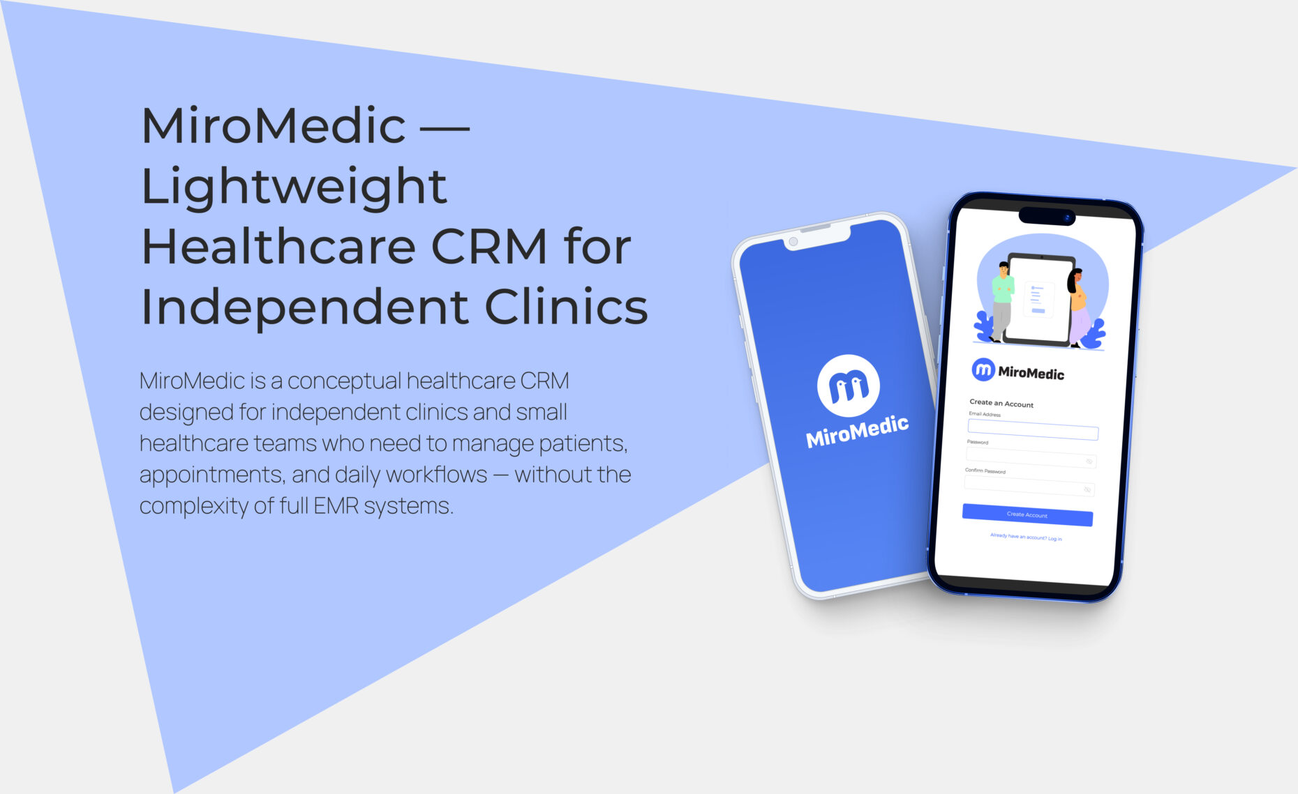
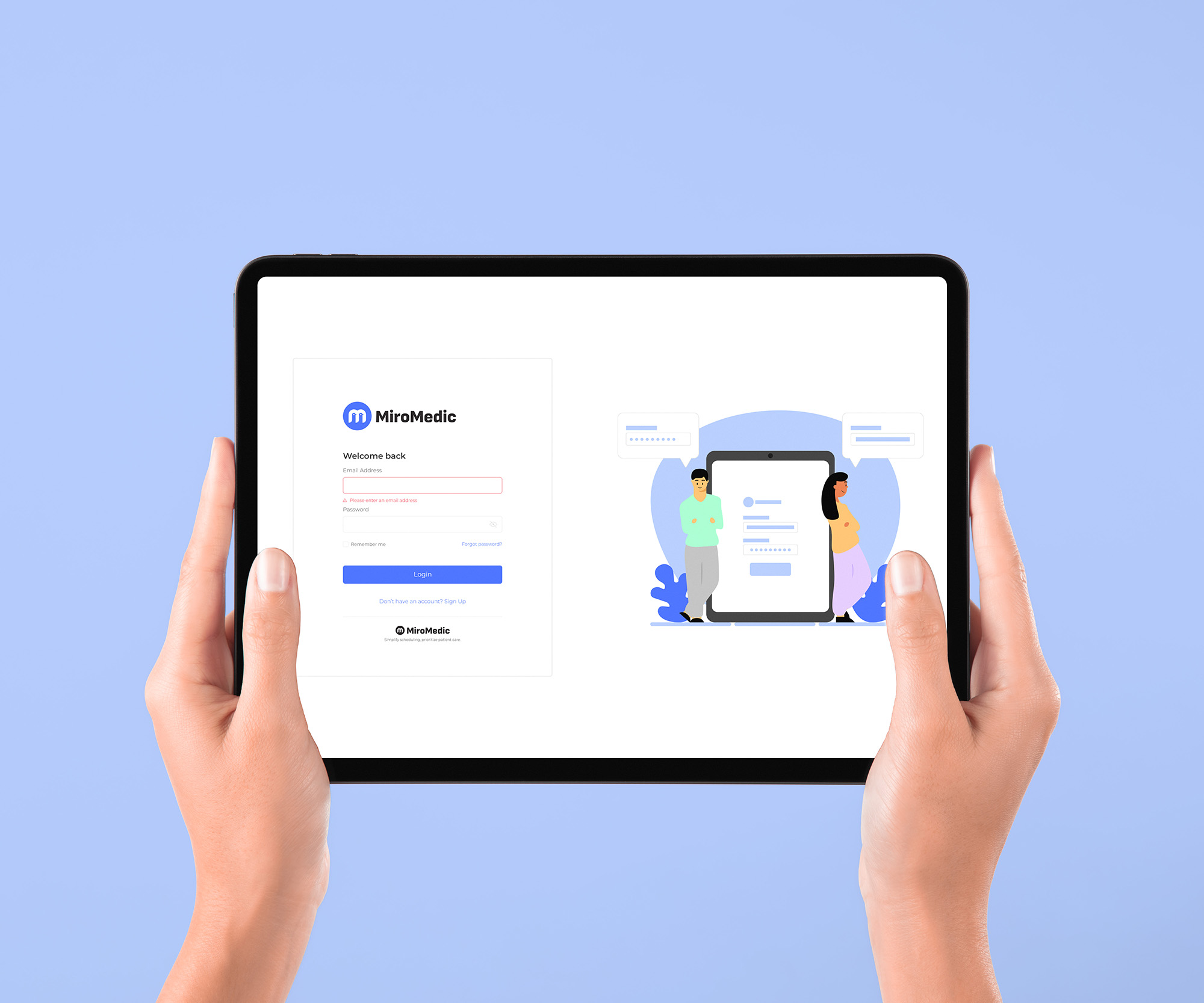
Authentication Experience
The authentication flow is the first interaction users have with the product, especially important in healthcare software where trust is critical.
The experience avoids unnecessary visuals or copy, focusing instead on clarity and reassurance. The result is an entry point that feels secure, welcoming, and professional.
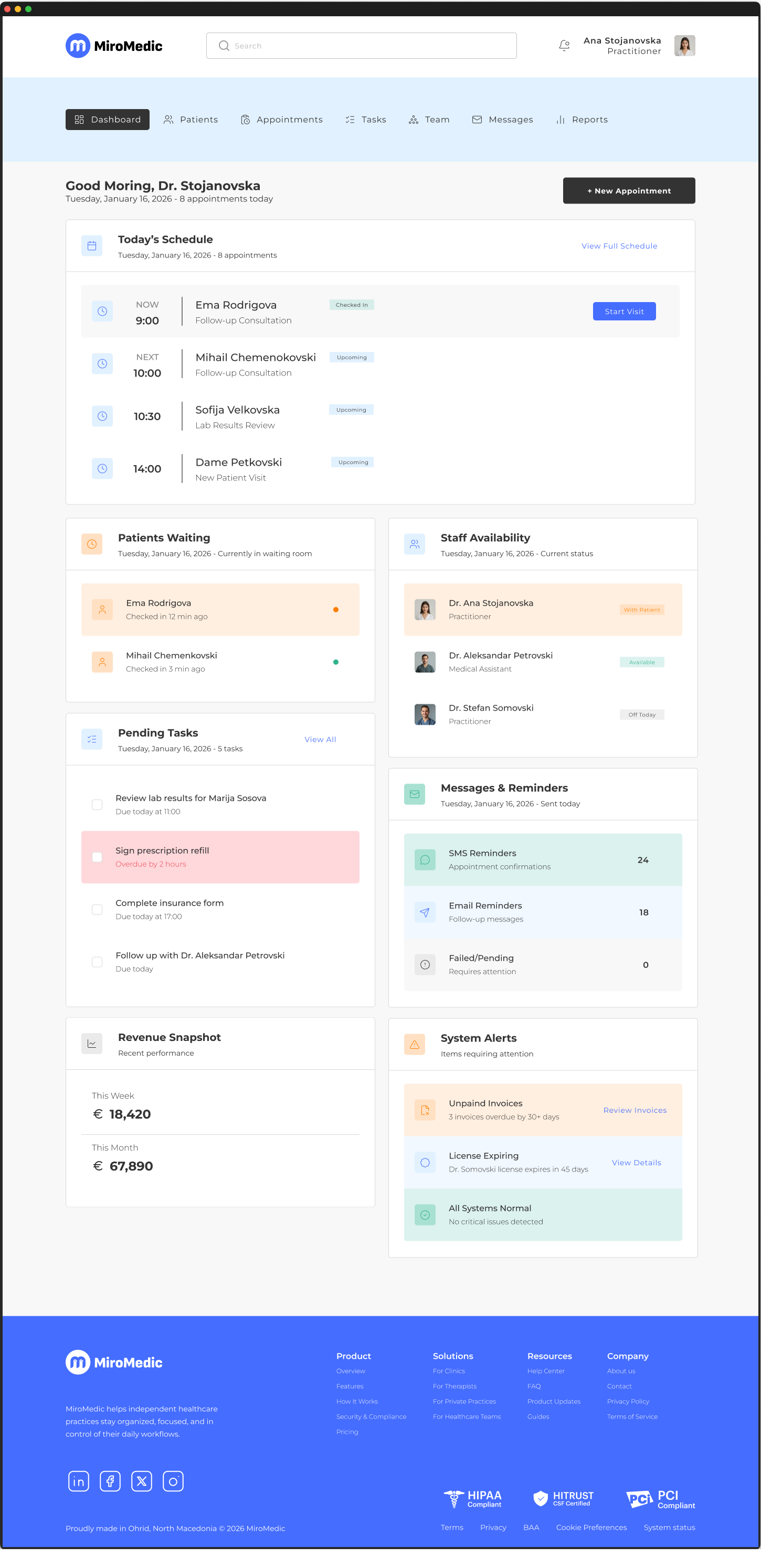
Dashboard — Smart Overview
The dashboard is designed around a single question:
“What needs my attention right now?”
Instead of overwhelming users with analytics or charts, the dashboard provides a smart operational overview, including:
- Today’s schedule and upcoming appointments
- Patients checked in or waiting
- Pending tasks and follow-ups
- Staff availability
- Messages, reminders, and system alerts
- A lightweight revenue snapshot
Each card is designed to be scannable and calm, helping healthcare professionals make quick decisions without switching between multiple screens.
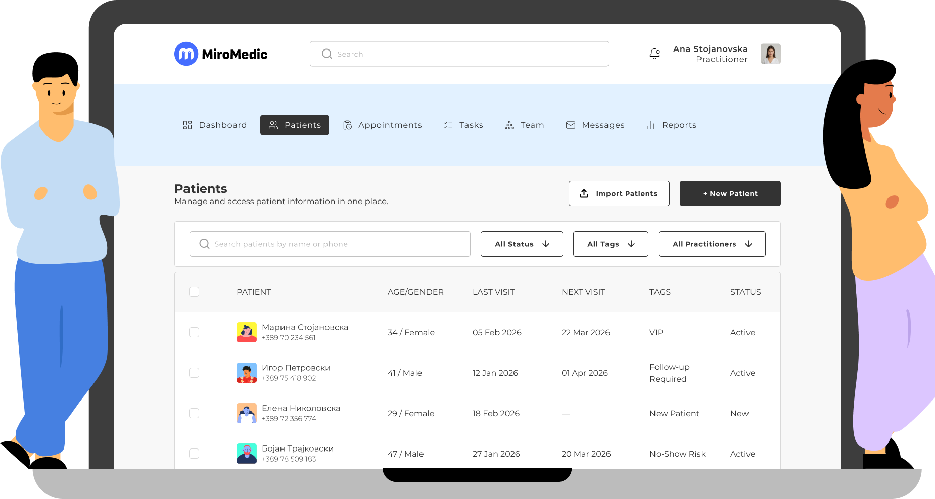
Patients Management
Patients are the core entity of the system.
The Patients page allows staff to quickly:
- Search and filter patients
- Understand patient status at a glance
- Access patient profiles with minimal friction
Patient profiles are structured around a timeline-based approach, bringing together:
- Appointments
- Internal notes
- Tasks and follow-ups
This creates a single source of truth for each patient, supporting continuity of care without the complexity of medical records systems.
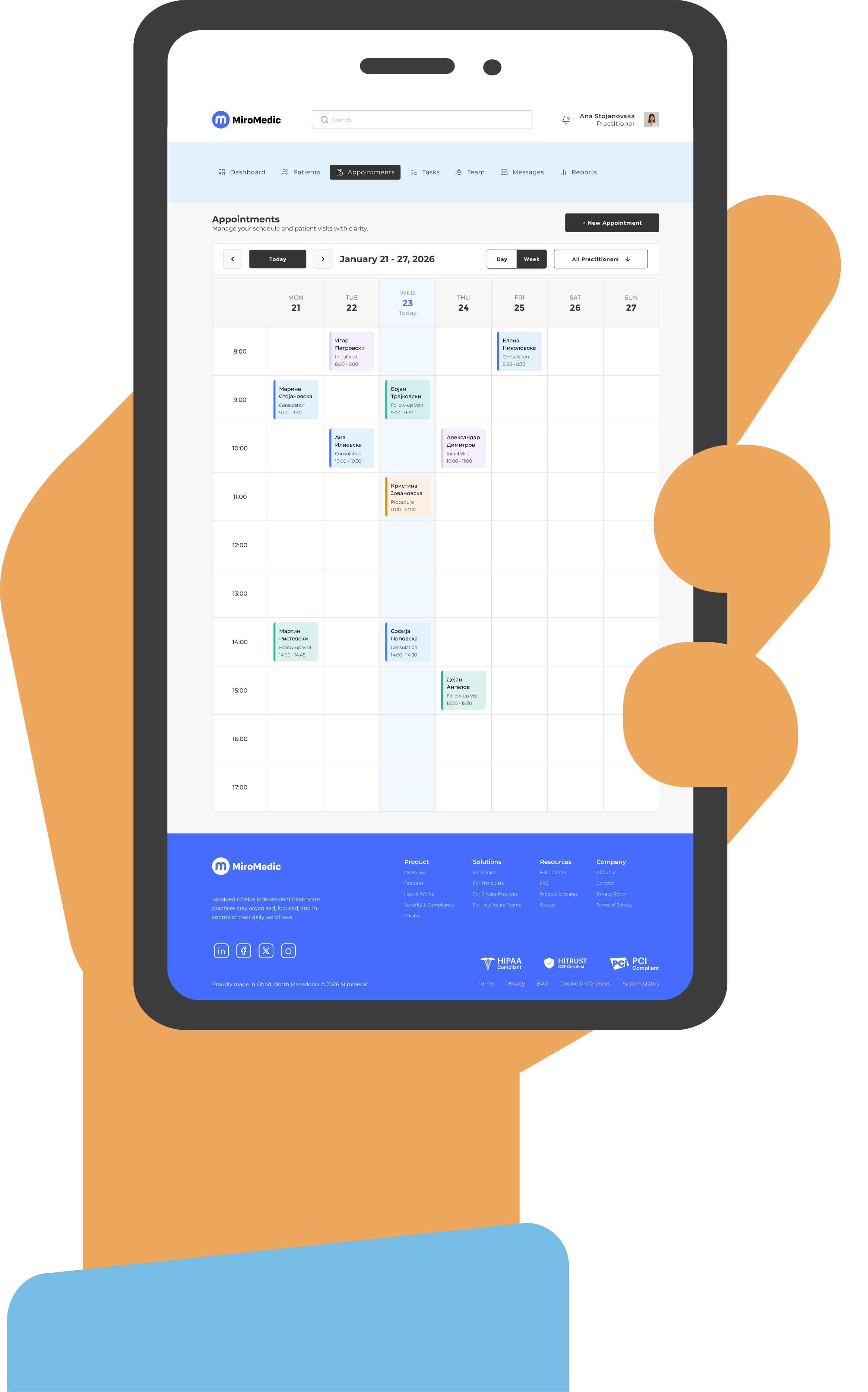
Appointments & Scheduling
Scheduling is one of the most frequently used parts of any clinic system, so speed and clarity were critical.
The Appointments page focuses on:
- Day and week calendar views
- Clear appointment blocks with status indicators
- Fast creation and editing of appointments
- Easy access to patient information
The design supports real clinic workflows, including check-ins, follow-ups, and status changes, while keeping interactions predictable and efficient.
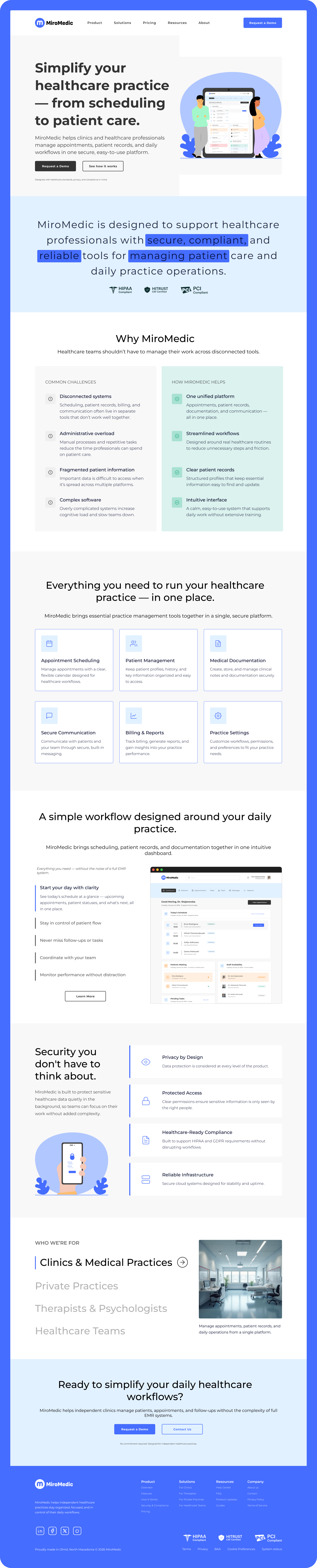
Marketing Website (Landing Page)
In addition to the product itself, I designed a complete landing page to present MiroMedic as a credible healthcare solution.
The landing page focuses on:
- Clear value proposition
- Problem → solution storytelling
- Feature overview without overload
- Product preview using real dashboard visuals
- Strong emphasis on trust, security, and simplicity
The marketing site and the product share the same visual language, ensuring consistency between what users see before signing up and what they experience inside the app.